Helping Babbel B2B to generate 500,000 € revenue
Overview
Problem
In 2022 Babbel B2B team experienced some high client churn and minimal overall growth of 0.64%.
Outcome
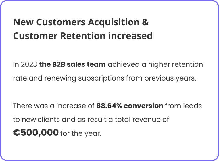
In 2023 the team achieved a higher retention rate and renewing subscriptions. There was a increase of 88.64% conversion from leads to new clients and as result a total revenue of €500,000 for the year.
Deliverables
• Design strategy • User research • Competitors Analysis • Information Architecture • Visual Design • Prototyping
Context
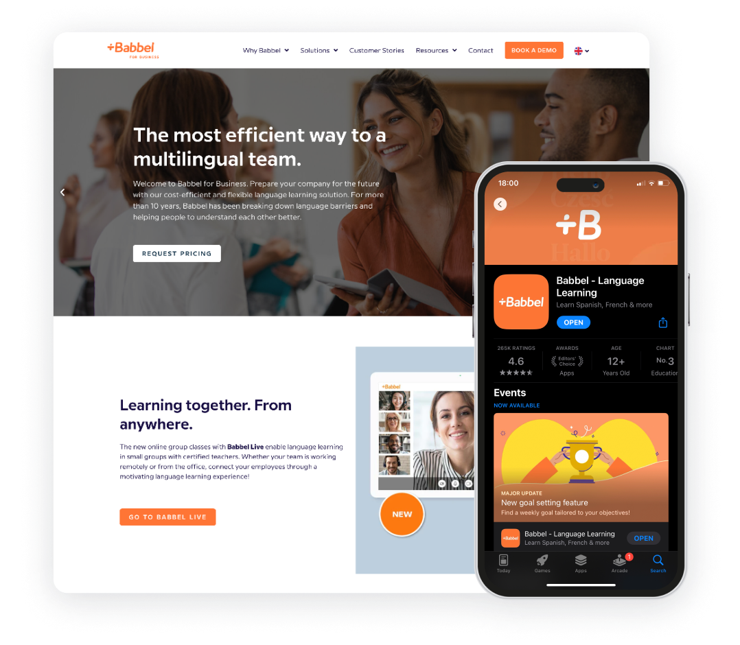
Babbel for Business offers language learning solutions specifically designed for medium-sized to enterprise companies.
My Role
When I joined the team, there wasn't a formal design process in place, and the product interface lacked user-centric approach. As the first designer in the B2B team, I focused on building a design process
that would ensure continuous improvement in the product's quality.

The problem
The product lacked a way to demonstrate ROI to customers, leading to a perceived lack of value.
In 2021, the B2B team had 2,200 clients.
While they acquired new prospects in 2022, they also experienced some client churn, resulting in a minimal overall growth of 0.64%

The Solution
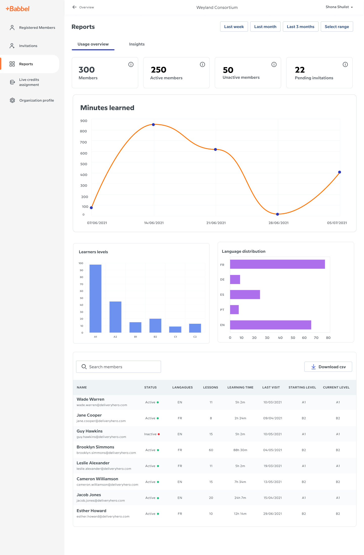
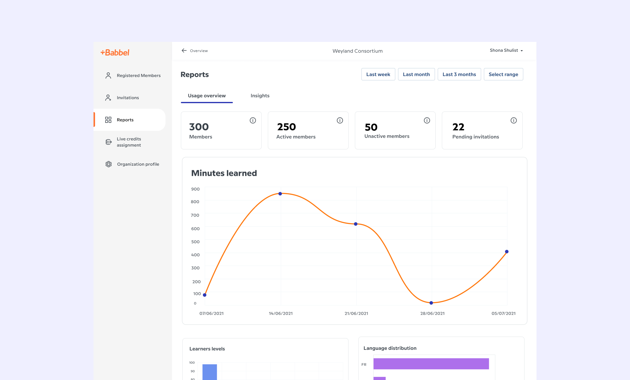
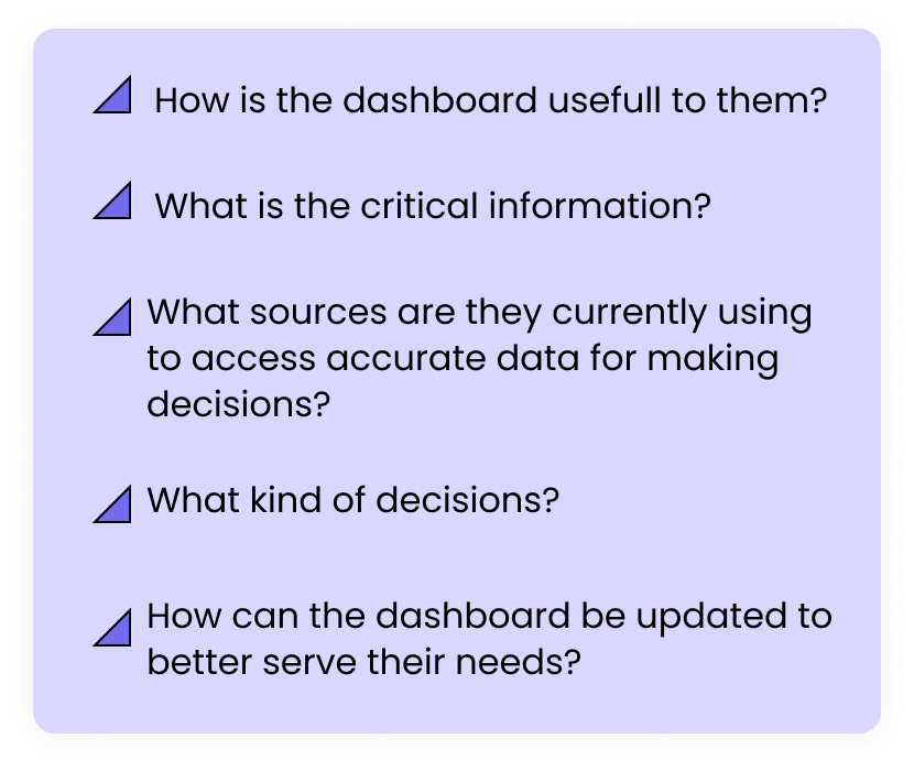
How might we create a reports dashboard for clients with information that is valuable and usefull?
Learnings
1. Our users prioritize minimizing the number of inactive learners (those not actively using Babbel).
This is reflected in the design of Babbel Admin, where the first data point displayed is a clear summary: total number of users, broken down into active and inactive users.
2. When the number of inactive users appears high, users will then drill down into the table and filter for inactive users for a more detailed view and from there they will take some actions to try to re-engage these inactive users.
3. Personalization and flexibility
Bigger companies require more flexibility from our feature. The possilibity to create specific groups and dedicated reports for them.
Results
